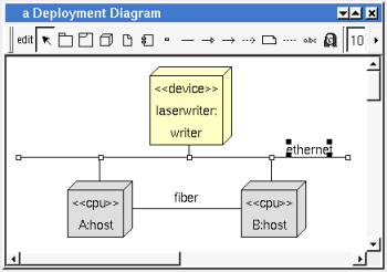

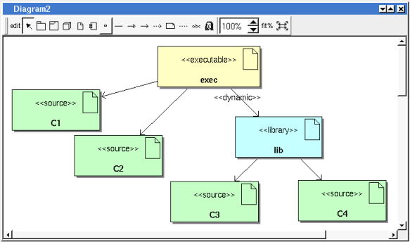
The deployment diagrams may be placed in a deployment view

A deployment diagram is created through the new deployment diagram entry of the deployment view browser menus.
![]()
The node menu appearing with a right mouse click on its representation in the browser is something like these, supposing the diagram not read-only nor deleted :
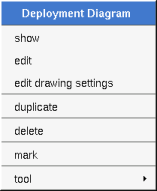
show allows to show the diagram picture, and edit it in case it is not read only.
edit allows to show/modify the diagram properties. In case the diagram is read-only, the fields of the dialog are also read-only.
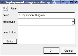
The proposed stereotypes are the default one specified through the Default stereotypes dialog more the current one (empty here). It is possible to choose into the list or to give a new one, or to empty it. The stereotype of a diagram doesn't have a special meaning for BOUML
The editor button visible above and associated here to the description, allows to edit the description in an other window, or to call an external editor (for instance Xcoral) specified through the environment dialog. Note that this external editor have to create an own window, its parameter is the pathname of the file containing the description, its execution is done in parallel with BOUML which looks each second at the file contents to get the new definition until the dialog is closed (I do not like very much this polling but this works even QT isn't compiled with the thread support).
This dialog allows to specify how the items of the diagram must be drawn by default, you may choose default for each value, in this case the effective value if specified in the upper level (which itself may specify default etc ... up to the project level).
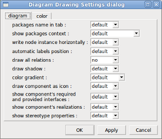
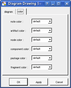
package name in tab : to indicate if the package's name must be written in the tab which is the small rectangle on the top (note : a transparent package doesn't have shadow) :
show packages context : to indicate if the context where the package is defined must be written, it is not the case just above. The context may be the “UML context” which is the path of the package in the browser (choice followed for awt below), or the C++ / Php namespace specified by the package, or the Java package specified by the package (choice followed for picture below) or at least the Idl module :

write node instance horizontally : Allows to write the the node type and the instance name on the same line (see host below) or on two lines (see laserwriter below).
automatic labels position : To ask BOUML to move or to not move the associated labels on the relations in the diagram when the relation is edited or the linked items moved etc ...
color gradient : by default the elements are colored without gradient, you can ask for to use a diagonal, vertical or horizontal gradient.
show stereotype properties : to indicate through a note the (non empty) value of the stereotype properties in case the element is stereotyped by a stereotype part of a profile. By default the stereotype properties are hidden.
Clone the diagram in a new one in the same deployment view.
The delete entry is only present when the diagram is not read-only.
Delete the diagram and all its representation in the opened diagrams. After that it is possible to undelete it (from the browser) until you close the project : obviously the deleted items are not saved !
See mark
The menu entry tool is only present in case at least a plug-out may be applied on the diagram. The selected tool is called and applied on the current diagram.
![]()
The diagram menu appearing with a right mouse click out off any item in the diagram picture is something like these, supposing the diagram not read-only :
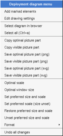
Only appears when a elements whose can be added in the diagram are marked in the browser, all these elements whose are not yet present in the diagram are added in the diagram, allowing to not have to do several drag & drop from the browser to them, but their position will probably not be the good one
Select all the items of the current diagram, may also be done through control a
To find in the diagram a representation of the elements selected in the browser
similar to the fit scale button, change scale to see all the diagram's elements at great as possible
Similar to the button
![]() ,
change the size of the windows to see all the diagram's elements with
the current scale
,
change the size of the windows to see all the diagram's elements with
the current scale
Copy all the diagram elements, equivalent to a optimal windows size followed by a copy visible picture part then a restore of the original windows size
Put the visible part of the current diagram in the clipboard (copy), it is a screen copy, the current scale have impact on the picture quality.
It is also possible to print all (not only the visible part) the current diagram on printer or a file through the button
To save all the diagram elements in a file, equivalent to a optimal windows size followed by a save visible picture part then a restore of the original windows size
To save the visible part of the current diagram in a file, it is a screen copy, the current scale have impact on the picture quality.
To memorize the current diagram sub window size and the current scale. These ones will be used the next time the diagram will be opened.
To memorize the current scale. These one will be used the next time the diagram will be opened.
In case a preferred sub window size and preferred scale was set, follow them.
To stop to define a preferred size and scale was set
By default the diagram's canvas size is 840 x 1188 points corresponding to an iso A4 format (210*4 x 297*4), all the predefined available formats are :
iso A5 : 592 x 840
iso A4 : 840 x 1188
iso A3 : 1188 x 1680
iso A2 : 1680 x 2376
iso A1 : 2376 x 3364
iso A0 : 3364 x 4756
USA A : 864 x 1116
USA B : 1116 x 1728
USA C : 1728 x 2236
USA D : 2236 x 3456
USA E : 3456 x 4472
USA Letter : 864 x 1116
USA Legal : 864 x 1424
USA Tabloid : 1116 x 1728
Each format also exists in landscape (it is Ledger in case of Tabloid)
The menu entry Custom allows to specify the size, the width and height can be set between 400 and 40000.
Undo all the changes made since the diagram was opened the last time. Note that the diagram is restored independently of the the project saving. Obviously the deleted browser items was not restored !
![]()
The menu appearing with a right mouse click on a network line is something like these, supposing the diagram not read-only :
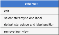
edit allows to edit the network :
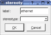
To select the network label and stereotype. Useful when you are lost after many label movings.
![]()
The menu appearing with a right mouse click on an association between artifacts is something like these, supposing the diagram not read-only :
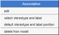
edit allows to edit the association :

To select the association's label and stereotype. Useful when you are lost after many label movings. Only appears when the association have a stereotype or a label or both.
To place the association's label and stereotype in the default position. Only appears when the association have a stereotype or a label or both.. Useful when you are lost after many label movings.
By default when you move a class or a relation point break or edit the relation, the associated labels are moved to their default position, this may be irritating. To ask BOUML to not move them automatically in a diagram, use the drawing settings of the diagrams.
Remove the association.
![]()
The dialog allowing to set the default stereotypes has a tab reserved for the diagrams :
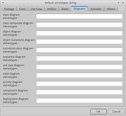
![]()


A deployment diagram may contain deployment node, network line, network connexion, component, fragment, notes, texts, diagram icons and the relations.
To place these elements in the diagram, use the buttons on the top (to create a new element or choose from the already defined ones) then click at the appropriate position in the diagram, or grab the element from the browser into the diagram.
The network lines may connect deployment nodes and/or network connexion. The network connexions (represented by small squares) allows to have network lines out of deployment node as it is the case in the picture above.
The scale may be changed from 30 up to 200 %. To allows to see the relation kinds even with a small scale, the size of the arrows is unmodified.
fit% allows to set the largest scale allowing to show all the picture, as it is possible. Because of the scrollbar management, hitting several times on fit% may give several scales.
Classically, the left mouse click may be used to select an element, or several when the control key is down, a multiple selection may also be done defining a region using the mouse left click out of any element and moving the mouse with the click and maintaining the click down. The diagram's elements may be moved after a left mouse click on an element and maintaining the click down during the mouse move. The right mouse click is used to show context dependent menus.
control s is a shortcut to save the project
control shift s is a shortcut to save the project in a new one
control p is a shortcut to print the active diagram
control a is a shortcut to select all the diagram's elements
control d is a shortcut to delete the selected element(s), the model is affected
suppr is a shortcut to remove the selected element(s) from the diagram, these elements are not deleted
control c is a shortcut to copy the selected diagram's elements
control x is a shortcut to cut (remove from diagram) the selected diagram's elements
control v is a shortcut to paste the selected diagram's elements
control z and control u are a shortcut of undo
control r and control y are a shortcut of redo
the keyboard arrows allow to move the selected items
You can define your own shortcut using the shortcut editor through the Miscellaneous menu.
The global menu miscellaneous allows you to show / hide a grid in the background of the diagram.
When several diagram's elements are selected, the menu appearing on a left mouse click allows to align or resize or distribute them :
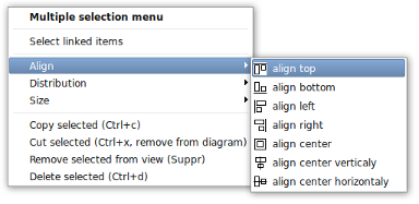
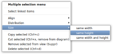
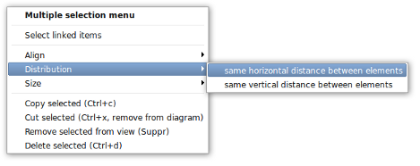
If all the selected elements has the same kind (for instance all are a class), you edit their drawing settings globally :
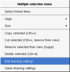
and for instance when the elements are notes :
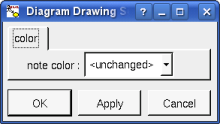
The settings valuing <unchanged> are not changed for the selected elements, in the other case the same value is set for all the elements.
You can also reuse the drawing settings set for the first selected element for the other selected elements.
A fragment is resizeable. To change the fragment's name choose the edit entry of its menu or double click on it
A right mouse click on a note show the following menu :
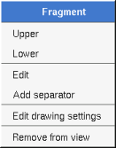
Edit drawing settings allows to change the fill color
A note may contain any text, a note is resizeable. To change the text of a note choose the edit entry of its menu or double click on it, this open a window containing the text, close the window to end the edition :
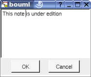
A right click on the edited note calls a dialog allowing some text manipulations thanks Qt.
A right mouse click on a note show the following menu :
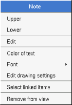
The font may be changed, by default the font is the one used to write the other texts.
The color of the text may be changed, a text is black by default.
Edit drawing settings allows to change the fill color
Select linked items select all the items connected this the current one through any line.
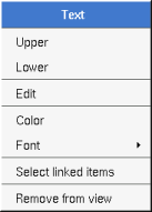
Text is another way to write a text, contrary to the note a text is written alone (see “upper diagram :” on the picture below), by default a text contains blabla: a text cannot be empty. The edition of a text is done like for a note. A text is resizeable, a resize is not automatically done when the contains is modified.
A right mouse click on a text show the following menu :
You can directly insert an image independently of the use of stereotype part of a profile, the size of the image is followed when the zoom is 100%. You can resize them, to go back to the initial size of an image just edit it (for instance through a double mouse clic on it) and confirm. Like for a profile the image can be specified through an absolute path, or a path relative to the root directory for the icons or relative to the project directory. In case the path of an icon is not absolute, the icon are searched first using the root directory for the icons, then using the current directory, then using the project directory.
When you insert an image or edit one the following dialog appears :

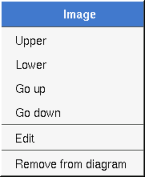
A right mouse click on an image show the following menu :
A diagram icon is a shortcut to a diagram, this allows to quickly navigate through the diagram without limitation (a class or some other item kinds may be associated to only one diagram). The used icon indicates the diagram kind, but its name is not written.
A double mouse left click on a diagram icon opens the diagram, the open entry of the diagram icon menu does the same thing.
A right mouse click on a diagram icon show the following menu :
![]()
The other diagram's elements have an own chapter, refer to them.
![]()
Previous : component diagram
Next : profile