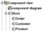
A component is an autonomous unit with well defined interfaces that is replaceable within its environment. In the old release of BOUML (up to the 1.5.1), the behavior of the artifact was defined at the component level.
A component may be placed in a component view or is nested in another component

A component may be created through the new component entry of the component view menu or through the component button of a component diagram.
![]()
The component menu appearing with a right mouse click on its representation in the browser is something like these, supposing the component not read-only nor deleted (see also menu in a diagram) :
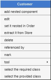
edit allows to show/modify the component properties. In case the component is read-only, the fields of the dialog are also read-only.
The tab Uml is a global tab, independent of the language :
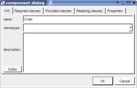
The proposed stereotypes are the default one specified through the Default stereotypes dialog more the current one (empty here). It is possible to choose into the list or to give a new one, or to empty it.
The editor button visible above and associated here to the description, allows to edit the description in an other window, or to call an external editor (for instance Xcoral) specified through the environment dialog. Note that this external editor have to create an own window, its parameter is the pathname of the file containing the description, its execution is done in parallel with BOUML which looks each second at the file contents to get the new definition until the dialog is closed (I do not like very much this polling but this works even QT isn't compiled with the thread support).
This tab allows to specify the list of interface the component requires.
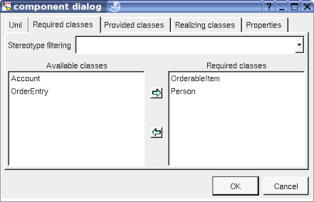
When a component C contains nested components, it is useless to
repeat the list of required interfaces at the level of C already
defined by the sub components, the right list will be provided when
you will add
![]() or
or
![]() .
.
This tab allows to specify the list of interface the component provides.
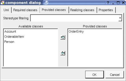
When a component C contains nested components, it is impossible to
repeat the list of provided/realized interfaces at the level of C
already defined by the sub components, the right list will be
provided when you will add
![]() or
or
![]() .
.
This tab allows to specify the list of classes realizing the behavior of the component.
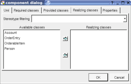
The menu entry set it nested in X is present when the component follow the component X in the browser. Choosing this entry the current component became a sub component of X.
The menu entry extract it from X is present when the component is nested in X (perhaps X is itself nested in another one, but it is not visible here). Choosing this entry the current component became a children of the parent of X.
The menu entry delete is only present when the component/artifact is not read-only.
Delete the component and all its representation in the opened diagrams. After that it is possible to undelete it (from the browser) until you close the project : obviously the deleted items are not saved !
To know who are the classes associated to the component, and the components referencing the current one through a relation.
See mark
Appears only when at least one plug-out is associated to the components. To apply a plug-out on the component.
Appears only when at least one class is required/provided/realized by the components. To quickly select the appropriate class, the current component may also be quickly selected from its associated classes.
![]()
The dialog allowing to set the default stereotypes has a tab reserved for the components :
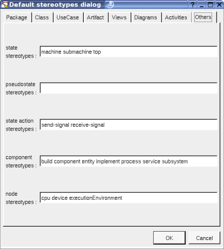
![]()
A component is drawn in a component diagram or a deployment diagram, following the drawing settings they may be drawn as a rectangle containing the component icon (UML 2.0 notation) or as a component icon being a rectangle with two lobes (UML 1.5 notation) :
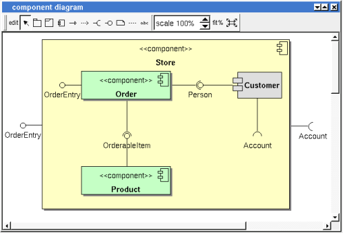
If the component is stereotyped by a stereotype part of a profile and this stereotype has an associated icon, this icon will be used when you ask for draw the component as an icon, the image is unchanged when the scale is 100% else it is resized.
The default color of a component may be set through the drawing settings.
A right mouse click on a component in a diagram calls the following menu (supposing the component editable) :
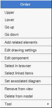
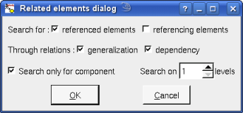
to add elements having a relation with the current element, the following dialog is shown :
These drawing settings concerns only the picture for which the menu is called.
A settings valuing default indicates that the setting specified in the upper level (here the diagram) must be followed, obviously this one may also be default ... up to the project level. When you add a component in a diagram, all the settings are set to default.

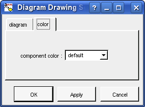
show ... : allows to write or not the component's interfaces and realization into its drawing as a compartment.
set associated diagram allows to automatically open the current diagram when a double mouse click is made on the component representation in a diagram or the browser. After that the only way to edit the component is to choose the edit entry in the menu.
![]()
Previous : flow
Next : artifact